RETAIL
Douglas
In-store Promotions & Visual Merchandising
Especially for you
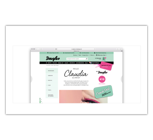
Douglas is a German based, leading company in the beauty care sector, with more than 1,900 stores in prime locations allover Europe. Amsterdam-based design duo The Thirsty Fisherman were asked to develop a concept and ideation on how to introduce a new and improved customer loyalty program to Douglas customers. They asked me to team up with them on developing the design and on making a manual for internal use at the client.
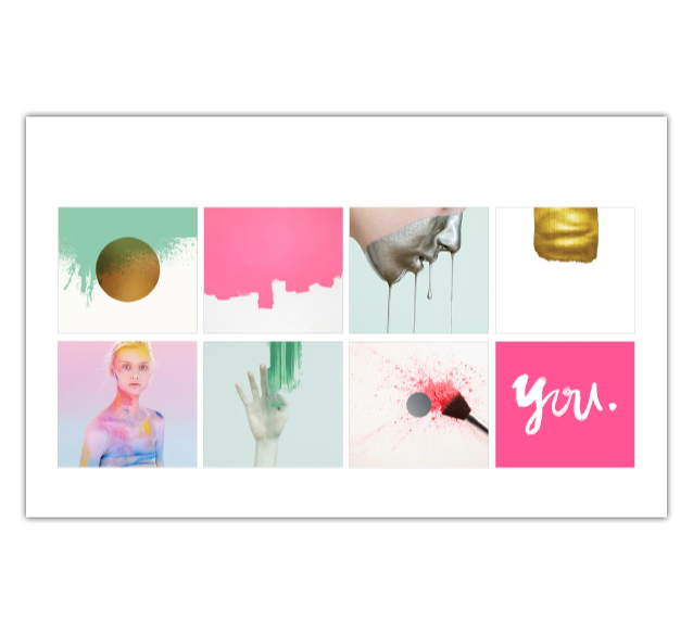
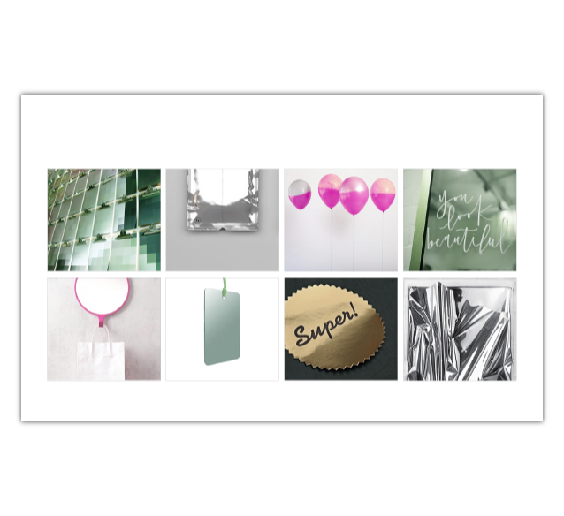
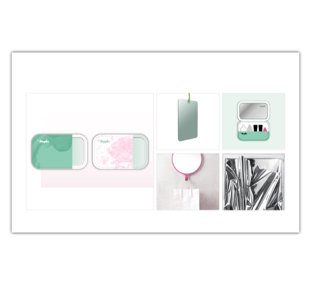
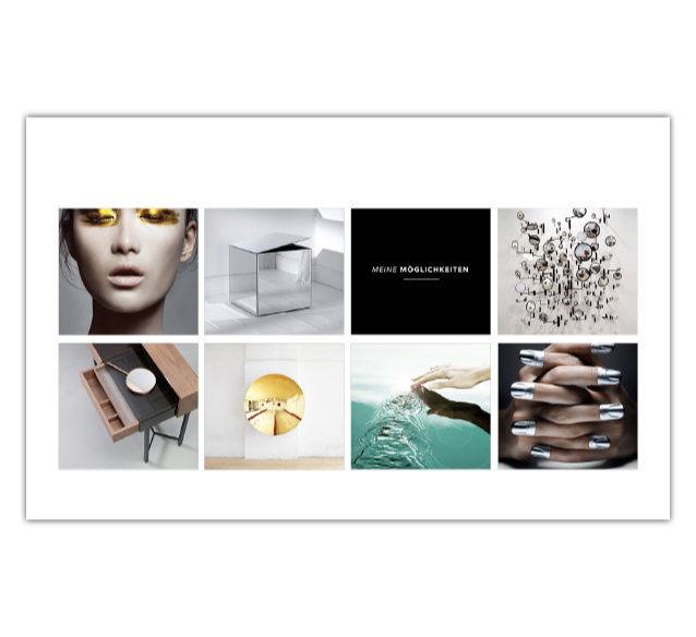
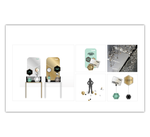
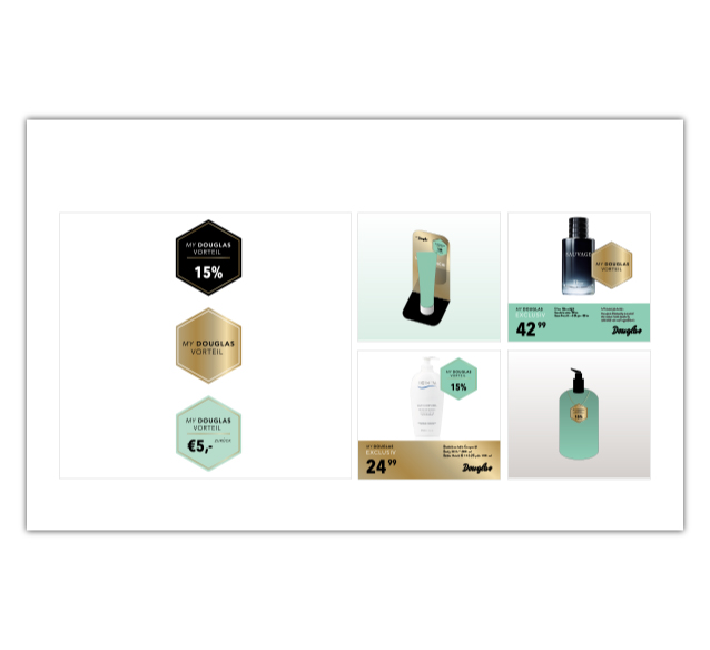
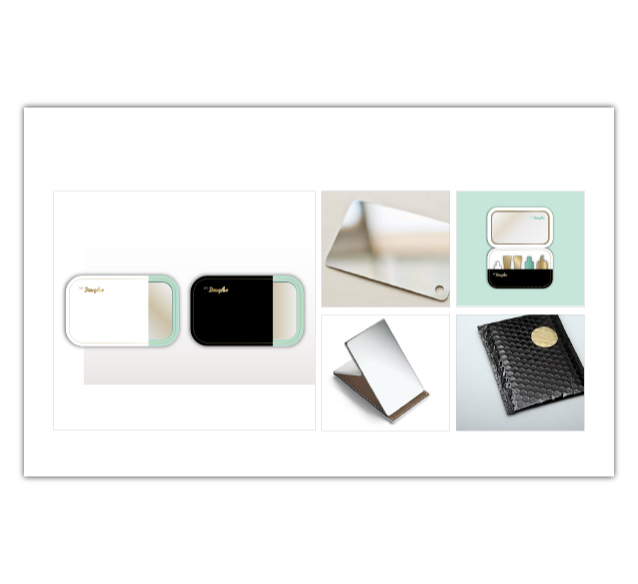
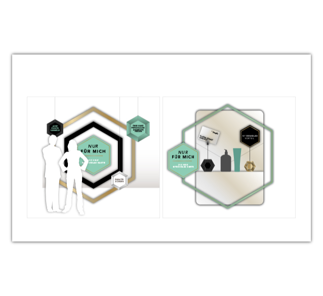
The Douglas brand identity was at the foundation of all designs, but — by playing with color, photography and objects — we managed to develop a specific and distinctive look and feel suitable for getting the customer loyalty program across properly.
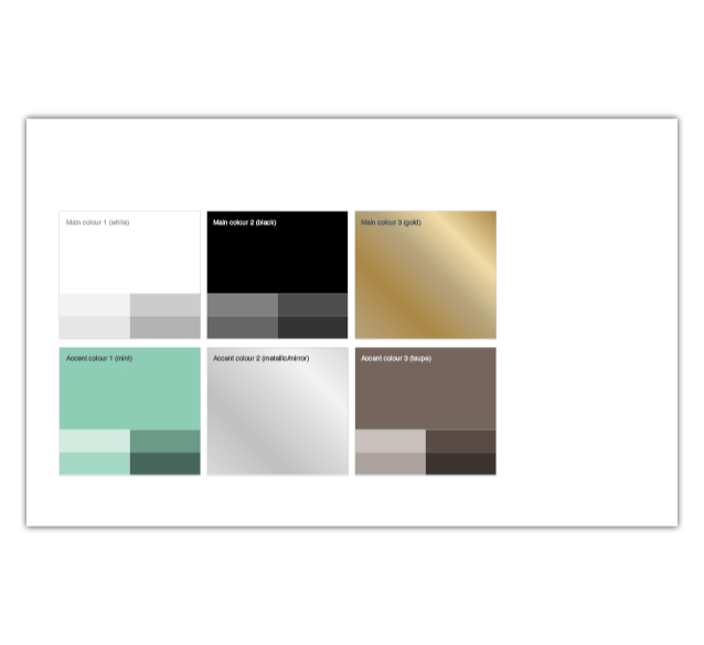
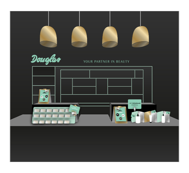
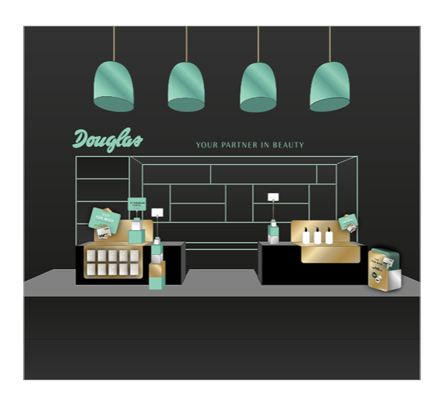
We started out exploring two possible design directions. However, quite soon it was decided to continue with the direction that mostly expressed an air of exclusivity. The basic palette of minty greens was expanded with gold and silvers. The overall look is one of understated luxury, in order to be able to make strong statements in a store environment that is already visually crowded.
Research into two possible design directions
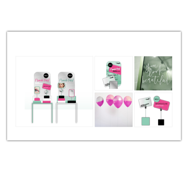
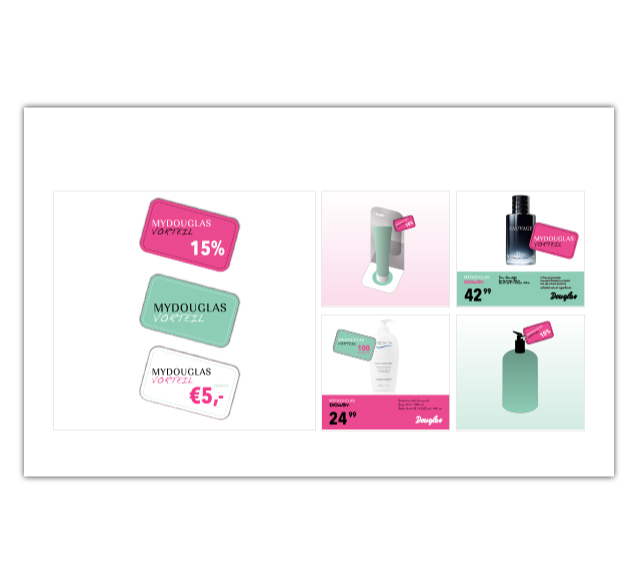
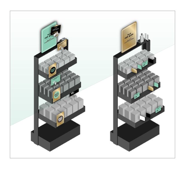
Ideation examples from the campaign manual
IN PARTNERSHIP WITH
TEAM:
Erik Schuur
Design
John van Dorst / The Thirsty FIsherman
Creative direction
Esther Visser / The Thirsty FIsherman
Design & Account management


