Science & Education
MOPO
(Masterclass Opbrengstgericht Passend Onderwijs)
Brand strategy, visual identity, website & print
Mastering Educational Growth
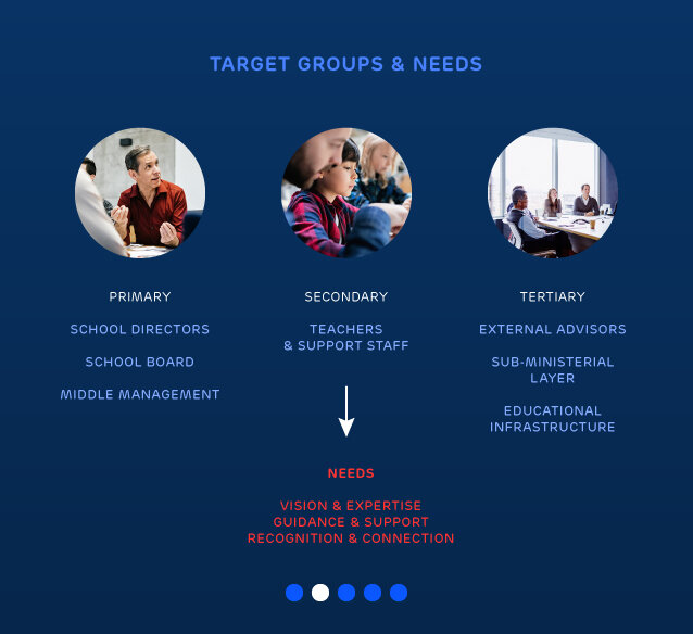
MOPO is an organization that educates and supports teachers and other professionals in primary education with implementing so-called ‘Results Aimed Fitting Education’. This is a leading educational concept within the Dutch educational system. It however often confronts schools, teachers and others with quite a challenge because it’s hard to combine the concept with the required attention for the growth and wellbeing of each individual pupil. MOPO helps to overcome these issues by offering things such as Masterclasses, an online grading and tracking tool and a series of publications.
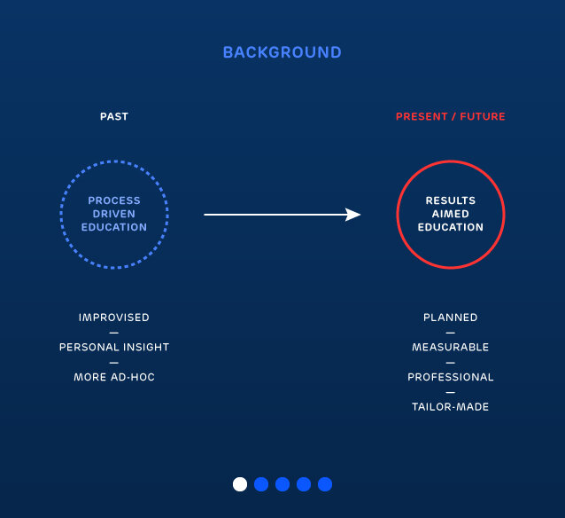
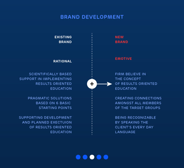
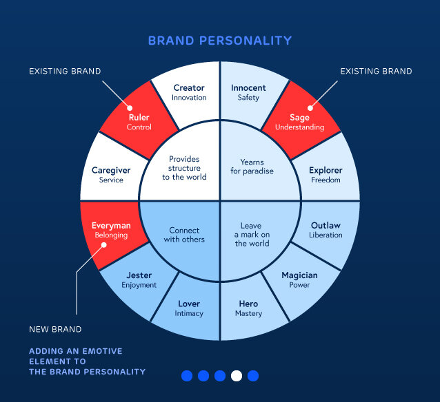
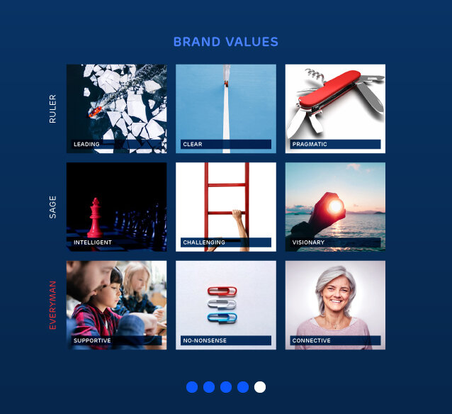
Being not always as well known as their main competitors, the main aim of the project was to create a brand that comes a across as a strong, confident and science-based leader but that is also able to make a more emotive connection than it did before.
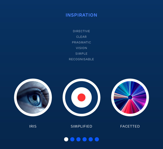
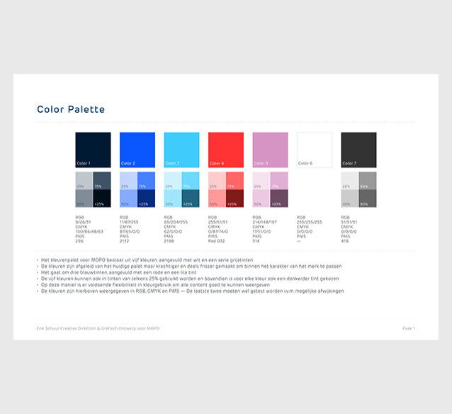
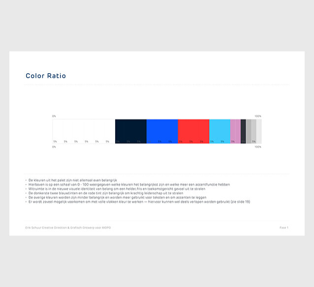
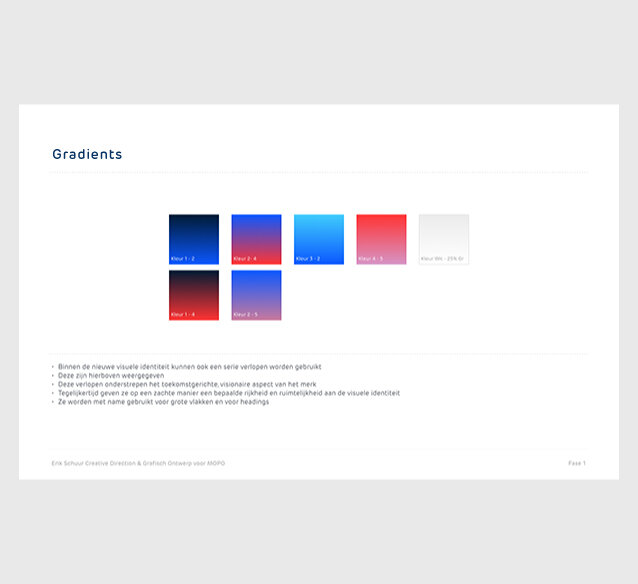
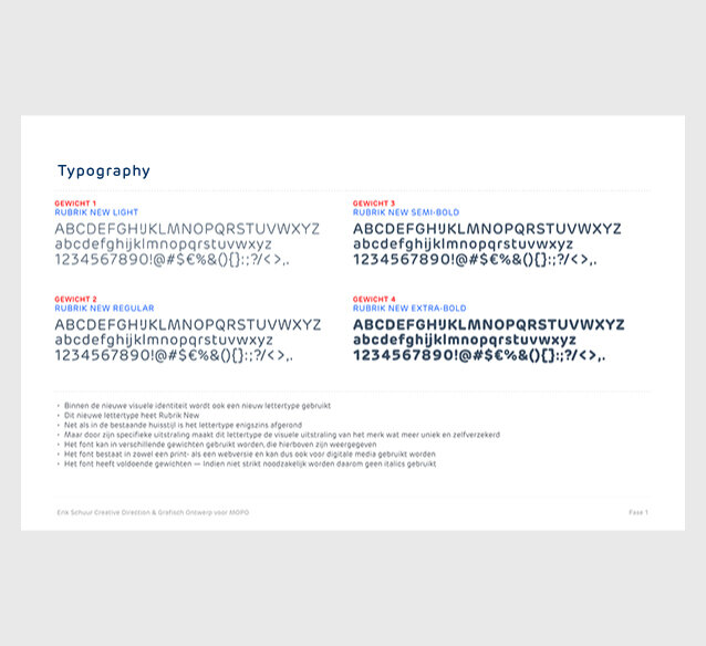
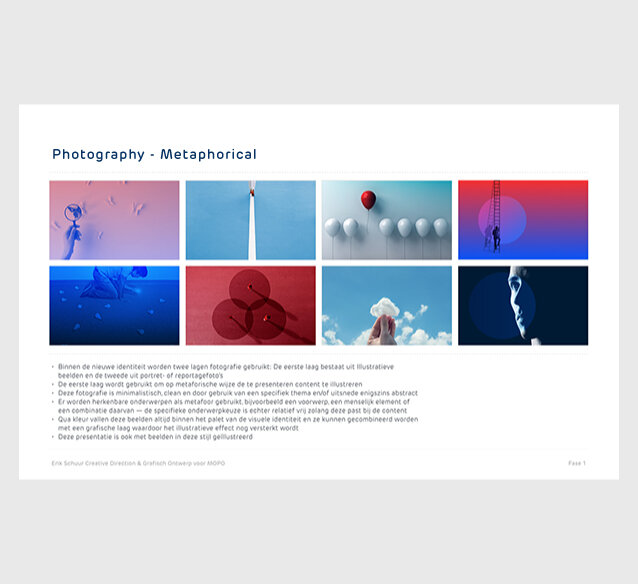
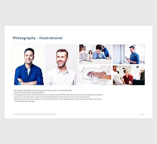
This was solved by creating a visual identity that combines a strong, but clean and simple graphic language with rounded graphic elements and type. The already existing color palette was strengthened by picking a stronger shade for each color. The previously typographical logo was changed into an icon that symbolizes an eye’s iris — it can differ in color, depending of where in the brand it is used. In order to ensure a certain level of emotiveness, snapshot-like photography of the world of education was added.
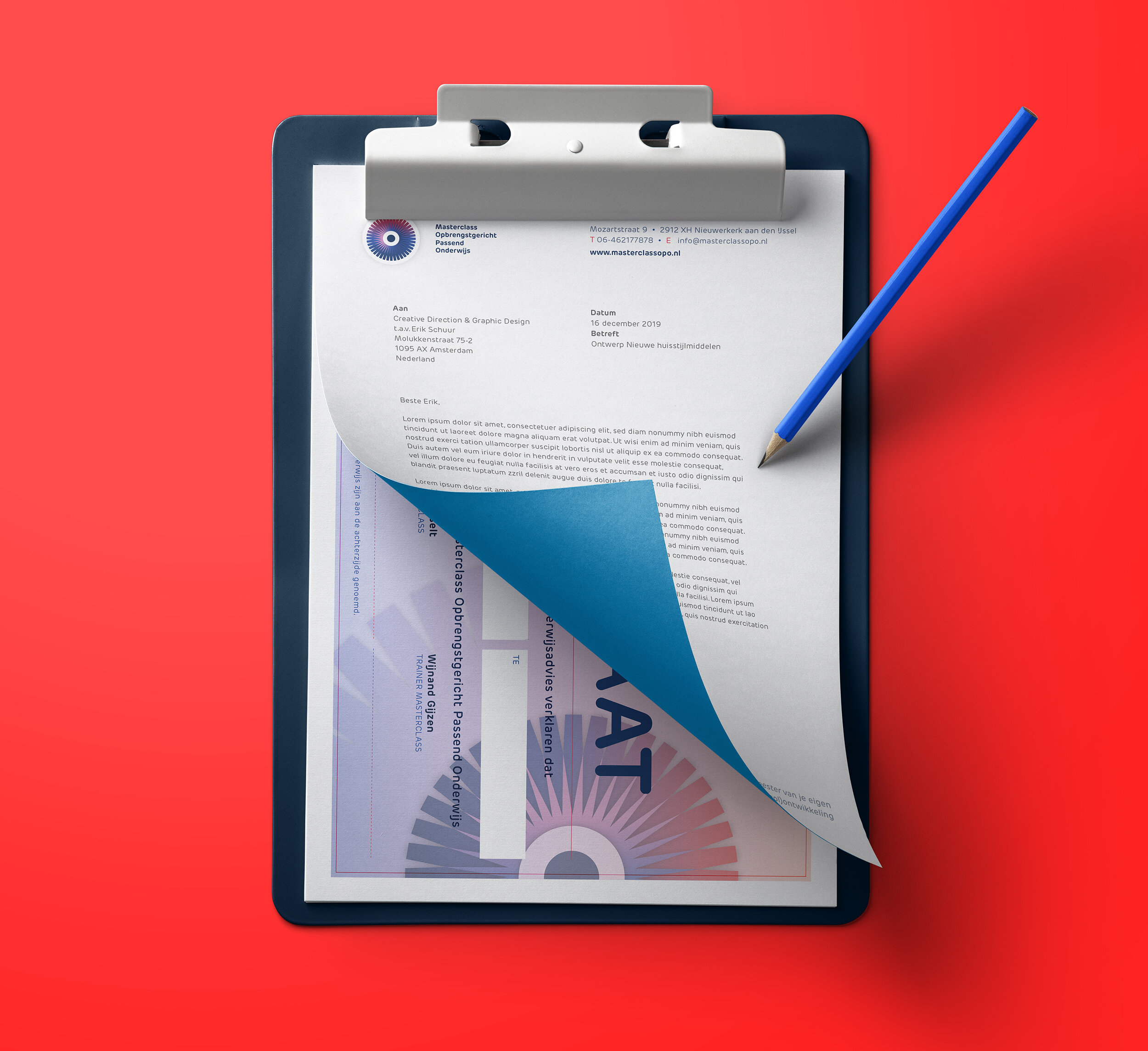
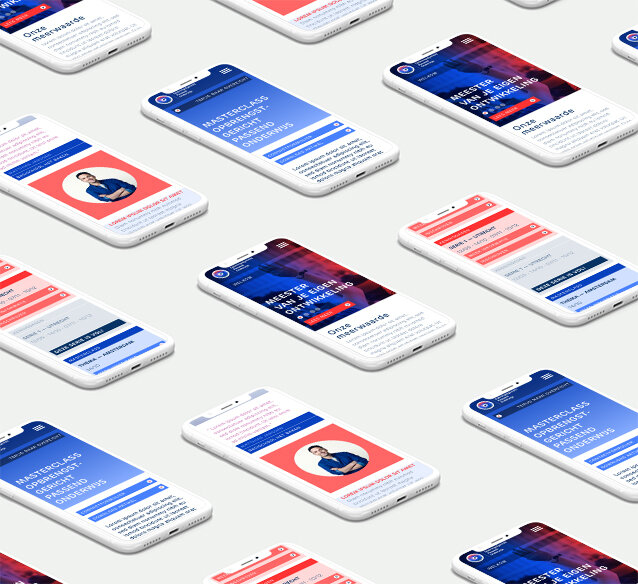
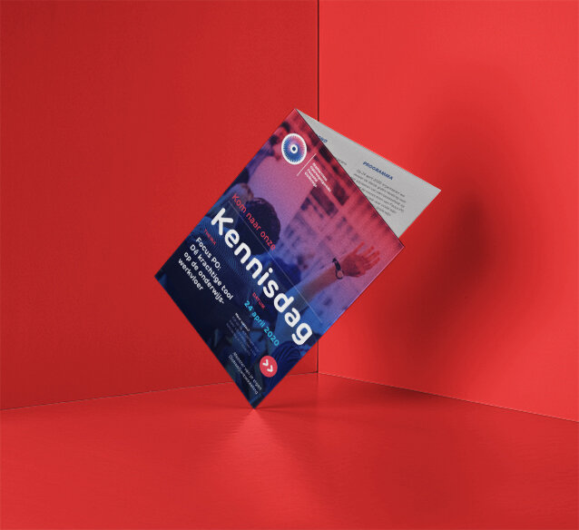
This new identity was then applied to all kinds of communication tools — from a website and online working tool to stationery and a diverse package of print collateral.
The new brand identity was developed during the strategy phase
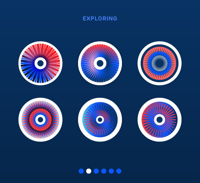
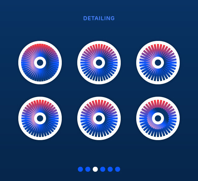
Working towards the new logo
Visual identity building blocks
The identity also contains several custom-made icons
Various stationery items
Overview of several pages and details from the main website
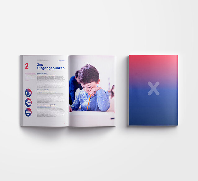
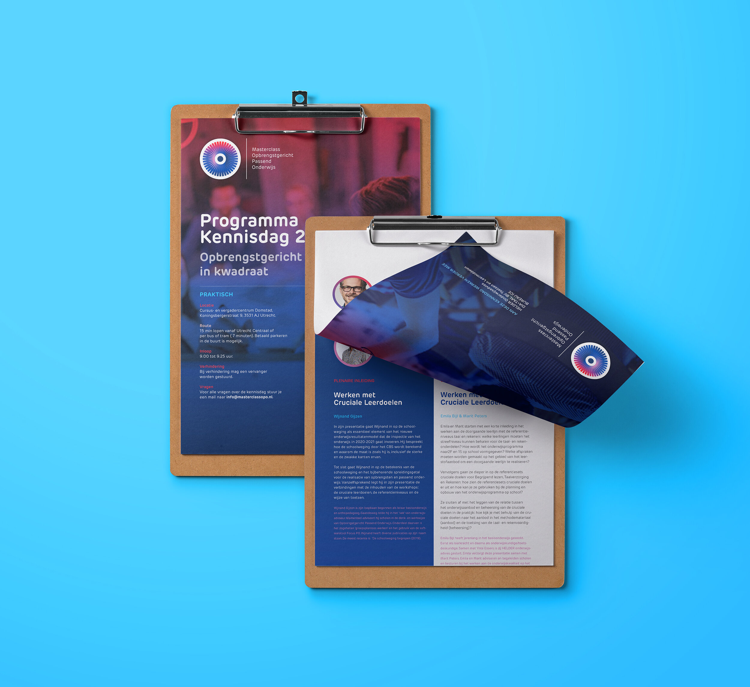
Several examples of information and sales brochures
Digital template for items such as a Powerpoint template
TEAM
Erik Schuur
Strategy, creative direction & design
Petra Gijzen
Graphic design & DTP

